Better late than never – St. Nicholas of Myra Icon

Story time with Auntie Anna:

Back in the day, which is always a Wednesday, before we began our Knowne World Tour, it was arranged for Jeff to get his Silver Crescent at the same event as his Maunche because he was leaving Portsmouth for San Diego. Because of this, scroll requests got backed up. I wrote the words for his Crescent that was read in court, but he had no scroll. I promised him I would write an icon for him. THEN-

He left for Caid.
I got assigned Konstantia’s Herald Extraordinary scroll.
I wrote my thesis.
I moved to Caid.
He deployed.
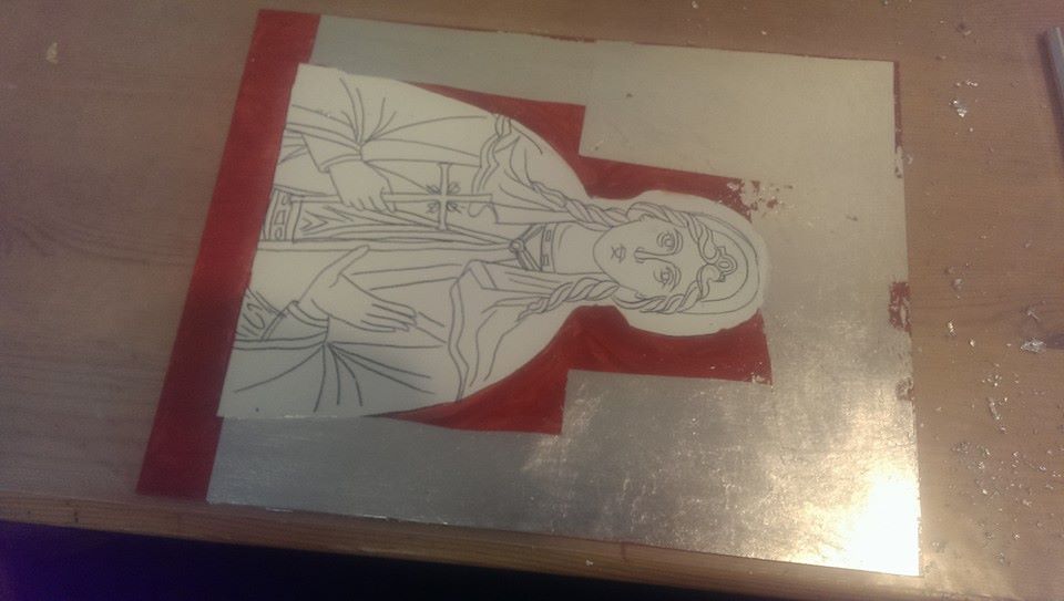
I got the gilding down on this.
His backlog scroll came in from the East, and it’s lovely and I gave up.
He came back.
I did things other than paint.
We moved to Trimaris.
I was like, “Oh I still have this.”
And he was like, “So where is it?”

Here it is. 3 years later.

Panel is one of my handmade ones on a birch art panel with my own gesso. It is a hot mess and was not easy to paint on. I noticed the places where I didn’t sand as well, or touched a lot during demos and displays were prone to pitting and bad adhesion of the tempera. On the bright side, a lot of the flaws I had were the same flaws I saw on very old post-period/in-period panels. So there’s that, I guess. If anyone can take my experimental art and actually like it, it would be Gieffrei, anyway.

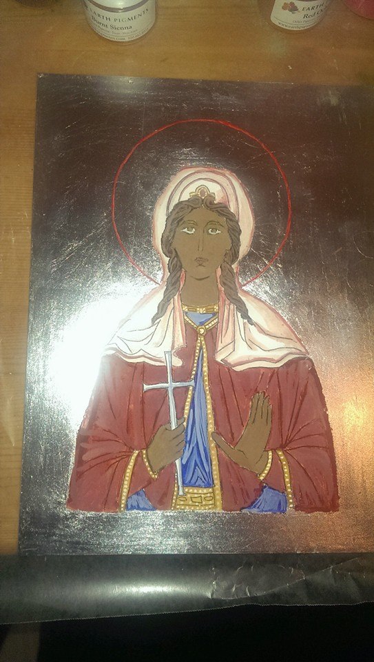
Saint: Nicholas of Myra, known to most of us as Santa Claus, but also the patron saint of sailors, and, of course, heretic puncher supreme. The reason I chose him should be evident. (Hint: Nothing to do with punching heretics.) The pattern is modern. Most period icons of St. Nicholas are rather boring and rarely show him with a boat/in a boat. Those are all post-period.

Green sky/blue water = Jeff’s arms, sans martlets, though in retrospect, I could have drawn one in. Green is also his favorite color.

Silver Crescent is on the boat, not only because service to his kingdom, but also to his country.

Inscription around the border: Γοδεφρείδος, Αργυρά Ημισέληνος της Ανατολής. “Gieffrei (Godefredus in Latin and Greek), Silver Crescent of the East.”

Main inscription just says Saint Nikolas.

After it cures for a couple of weeks, I will oil it, let it sit for a month, and then it can join the gallery on the staircase as an actual scroll.
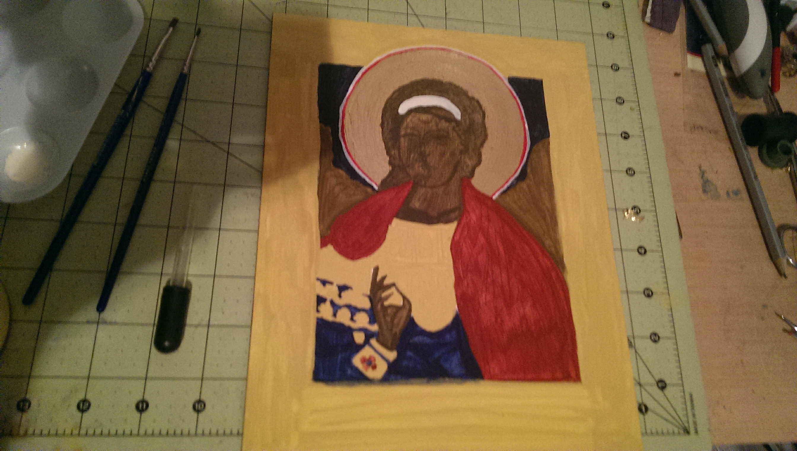
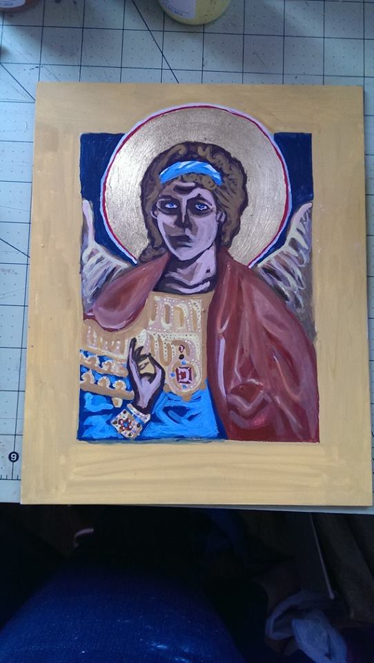
20181008_145334
The great shell massacre of 2018. Shells care of the Atlantic Ocean.

Progress Shots:

Finished:

20181015_141728

44056809_10156157548283143_8463197442899181568_o
So pretty. So…messy compared to my porcelain palette.

Icon-a-long with Anna 6: Completion

So, I don’t have a ton of pictures of this, mostly just the end result. The total was 3 floats of highlights, then the embellishments, inscription, shell gold, and border. Total amount of time on this one board: 15 hours. A “light” amount of work. @_@

20180529_163323
After the 3rd day of painting.
34017803_10155849494563143_6107643386984923136_n
Done!

Use of a pattern doesn’t necessarily mean a copy, so I decided to veer from the original and give a contrast border. The inscription is in Latin, rather than Greek, since the original had the same (from what I could make out).

33923748_10155849494928143_7986623697026809856_n

I did have some issues getting lines thin enough with my brushes. I think it’s a combination of my own pressure, them wearing out, and just not being thin enough for fine line work on smaller details. For icons where I just do the head or bust, they’re probably still fine, but I need to invest in tinnier liners! I also got a bit carried away with the shell gold on the Hand of God, but everybody loves gold!

I’m also utterly surprised at how good the horse came out.

34087442_10155849494618143_8935374473700311040_n

It’s now setting up to be oiled in a few weeks, and hopefully dry before Pennsic and delivery to its commissioner. I hope they love it!


Next up is the War Sew-a-thon, but I’m hoping to get some paint down on the icon of St. Nicholas next, which is doubling as a backlog scroll for my husband’s Order of the Silver Crescent.

Icon-a-long with Anna 5: Highlighting

There’s not going to be many pictures from here on out, because I need to concentrate. So I probably won’t make another post until I do the finishing touches in a couple of days.

Anyways, the next step is layers of highlights and lowlights. This could be as few as two, or many, many more. So far, I’m thinking this is going to be a 3-highlight layer icon, but I could be surprised. Some areas, like the landscape, won’t need a ton of work, but the horse and skintone will take much more work. The detail lines are saved for the last day, along with the inscription and the outer border.

The trick with the egg tempera is to create different viscosities of the color to get the achieved effect. So you mix your color, then add water until you get what you need. This doesn’t always work smoothly and can take some time. Likewise, I had to go back and darken some of the more solid areas where the paint dried patchy. I lightened the background to create more contrast from the dark yellow ocher, and put back in the linework. Skin color takes on a chalky look, which is why the beggar looks a bit…weird, if not skeletal, this will soften up with the next layer.

This is when egg tempera gets fussy.  While it dries fast, it takes overnight to cure. If you go back over a spot that’s wet, or didn’t cure, fresh paint can take it right up and leave you a hole straight to the gesso. You can see that on the horse’s haunch in the picture below. The best thing to do when this happens is LEAVE IT ALONE. Let it cure overnight, and then revisit it the next day. You really only get 2-4 hours to work on it anyway before this starts happening pretty much everywhere if you keep touching things, hence why the daily limit is so important. This is when patience is key, but it’s also a lot of fun as each day you get closer to a finished piece. I worked on the board for about 3 hours.

I’ll see everyone in a couple of days when I’m ready to finish it, and set up for the long cure before oiling.

No automatic alt text available.

Icon-a-long with Anna 4: Egg Tempera and Painting

Egg Tempera is a great medium, but it takes some getting used to. As far as iconography has gone, I have never used a ready-made paint. I have always used dry pigments mixed with egg binder, even in my not-so-great early pieces. I’ve since learned the quirks of it, but I still have a bit to go.

The binder is easy to make: egg yolk and white wine. The wine is optional, but it helps emulsify the egg a bit, as well as act as a preservative. Still, you only get a week, tops, with this stuff in the fridge after a day on your table.

stuff1
First, gather your supplies! The wine name made you giggle.

My mixture this go around was 2 yolks and about “that much” of white wine. I’ve gotten to the point of knowing the color I want for the right mixture. You can separate the yolk from the white by transferring the goop back and forth between the broken eggshell halves. Then you pop the yolk with a folk, and let it slowly drain into the jar, catching the membrane in the process. If the membrane goes in, it’s not a huge deal, but you just need to make sure you don’t suck it up in the dropper later.

As you can see, it’s not a ton of liquid in a standard size mason jar, but a little goes a long way. You use drops, not tablespoons.

20180526_14041320180526_140421

Once I get the magic liquid made, I go ahead and set up my table. I already had most of this out when the gilding started, but here you can see my collection of pigments, and that I taped wax paper down to protect my work surface. All of my pigments are from Earth Pigments or Natural Pigments, are are 100% natural earth or mineral colors. Mostly oxides, but also some crystals. The bagged jars are my quarantined toxic vermilion (mercury sulfide) and minium (red lead) pigments.

20180527_145752

20180527_145903

Egg tempera is backward from watercolor, you start dark and then add highlight layers. It seems weird, but it works. In iconography symbolism, you continue to “play God”, and build the paint up from the protoplasm, into a glowing, holy image.

Starting with the sankir, or base skin tone first. I mixed Antica Green Earth, and Roman Black. Think about the skin color of the Greeks and Middle Eastern people where this artform originated: olive based. Again, start dark, build up to light.

20180527_150122

20180527_150145
Dry Antica Green Earth.


Egg tempera can be fickle depending on how fine some of the pigments are ground, the material they’re made from, and how much moisture they suck up. Antica green is fickle and kind of grainy, so I had to adjust as I went along with more pigment, egg, or water, depending on my needs.

I made a ton of sankir, so I painted all three icons with it. This isn’t always the best approach and it sort of busted my flow for the rest of the day, but they all have the same base mix, which is good. The rest of this icon-a-long will be for St. Martin.

I don’t have pictures of work on Martin, because, well, I was painting. It’s a time consuming process, and it takes hours. Total amount of work today alone was about 4 hours.

20180527_152514
You work the paint in tiny brush strokes from a small drop on the board, rather than long strokes.

20180527_15320120180527_154535

The perfect cloak red in icons comes from vermilion, real vermilion. I have a few different reds, but nothing paints like the real thing. So the real thing needs precautions. I keep it quarantined in its own baggy, with its own tools. Instead of using one of my palettes, or shells (I do have shells, the porcelain is just easier to clean) I use a plastic spoon that I can keep separate. While vermilion is considered inert once painted, the dry form is still toxic, it is still mercury, and needs to be controlled.

20180527_200828

Of course, once I got started with it, a warm fuzzy thing decided to distract me.

20180527_201442
That’s Harald Hardrada, Varangian kitty, King of Norway, Maine Coon superfoof.
20180527_201005
That red, though.

I had to use a tiny bit of the minium as well. It’s one of my favorite colors. As shocking orange as you can get, and a fully period color.

20180527_203352

After getting tired, taking a break halfway for dinner, and coming back to it, and still getting tired while finishing up the background, which is okay, because more coats will make it more opaque, but I’m bushed. I know it looks super weird, but over the next few days, the icon should “appear” as I add the highlights.

20180527_205716


Painted linen wall hangings

I managed to get back to the Met last month, and spend a whopping six hours there, never getting off the first floor. Again. Well, except for the Roman study rooms, but I digress. They have a really neat exhibit right now under the stairs in the Jaharis vault (where my favorite tunic was) that shows off some very cool painted liturgical linens from the late Roman/early Byzantine Egyptian period.

I’m going to start trying the technique, as it doesn’t look too daunting, it’s just egg tempera on linen, either pure white or dyed indigo. I figure if I can frame the fabric in an embroidery apparatus, it should work. As far as I know, the fabric wasn’t sized or gessoed prior to painting, at least it didn’t seem that way, so this could turn into a big mess. Should I succeed, I see a very nifty, period way to display heraldry indoors.

Here are the photos that I took, but if you can, definitely get to the Met and see them in person. The exhibit link is here: http://www.metmuseum.org/exhibitions/listings/2015/new-discoveries


Icon do it! St. Lucia of Syracuse icon completed!

So last spring after another botched attempt at iconography, I was prepared to give up the art form entirely. I’m not a painter, and the stuff I draw primarily is Japanese anime, which is, uh, so not period or even appropriate for icons at all.

This fall, I was asked to offer my skills as an artisan to the East Kingdom gift baskets to be given out at Pennsic. I accepted, but I wasn’t sure what to do. I decided, reluctantly, to pick up the brush again, but first I needed to practice.

I invested in new supplies: new pigment colors, new brushes, real gesso, and bole and olifa from an icon supply place on the internet.  I also went and got some real gold leaf, despite still having way too much composite from my previous projects I should use up first. I have silver and copper composite leaves that I picked up cheap from an art supply store locally, so I wondered if they would be of any use on practice pieces before I potentially wasted the good stuff.

Most icons are done in gold, but there are a few in silver encasement. After I did some digging, I did find this 11th Century icon with embossed silver leaf, so I figured that was at least some evidence that silver was being used in period on icons.  I used this as an excuse to blow through 4 sheets of composite silver on this piece.

silver_icon
Embossed silver icon from the 11th Century.

I chose St. Lucia since she was from the same town as my persona. Local saints were prized in the Middle Ages, and that’s a good enough reason to assume that I would have strongly venerated her. She is also a patron of seamstresses, so a little saintly intervention in the sewing room can’t hurt. 😉 There’s plenty of modern icons patterns to choose from on the internet, so I picked the one I wanted, grabbed one of my remaining Gessobords (This one is 9″x12″), played with carbon paper, and followed the same steps as I did previously, only on the pretense of leafing all the things. The leafing took about 3 hours. Even with the larger sheets of fake stuff.

lucia_bole lucia_silverprocesslucia_silver

I soon learned that embossing composite leaf was not going to work. I did more damage than anything, so I repaired the leaf where I borked it up, and decided to leave it flat. There’s plenty of flat gold icons. I may not be able to find a flat silver one, but we’ll call this a creative anachronism. (I mean, composite after all.)

So the painting started, with the layers being applied over several days. Mostly snow days, thanks to the lovely winter we’re having in New England. (Lovely as in @@#!#$$!!!!)

lucia_roskrishlucia_highlight2

I started to get nervous as I began to work toward the upper most highlight layers, this is where I had screwed up before. So, taking deep breaths, and using my new, thin brushes, I worked carefully, putting in no more than 2 hours a day over the course of about 7 days total. The finished results shocked me, they shocked my husband, they shocked my friends. I couldn’t believe I pulled off an icon that well, looked like an icon.

lucia_highlight3lucia_almostdonelucia_done1 lucia_done2 lucia_done3

I did it! I really actually DID IT. The best part is that she’s for meeeeee! I get to keep her and admire her next to poor Archangel Michael and show her off in displays without feeling mortified at my attempt.

The only real thing I don’t think I will ever do again is leaf or gild an entire panel. It was a pain it the butt to paint over where it accidentally got on the drawing. In fact, her halo and inscription are actually in acrylic. I had to cheat in order to get anything on the leaf. I’m sure that the real gold won’t act like the fake stuff, but I’m not about to try it right now and find out. Let’s get better at what I’m doing before I start ruining sheets of 22k gold.

In the mean time, Lucia is aging over the next week or so before I seal the leaf and oil the painting with olifa. And I plan to bring her and some other goods with me up to Montreal for King and Queen’s Arts and Sciences next month.

I also re-did my Iconography page with a more complete gallery and link to my tagged archive. Do go check it out.

Experiments in Iconography Part III: Egg Tempera

Here’s some action shots of my last 2 days of work. I have to let it cure overnight, so I can’t put more than a few hours of work in at a time. That and my eyes start going “NO.” And I get impatient.

Egg Tempera is a solution of egg yolk and white wine. I had a heck of a time separating the egg, then puncturing the yolk, but I was able to make the solution with some pinot grigio.

egg
Yum.

You add this to natural, dry pigments.

pigment
No lead. Promise.

Then you start laying down the sankir, or skintone layer, and eventually all of the dark under layers. This is called the roskrish. This is what I got done last night.

roskrish1roskrish2roskrish

Today I started the highlighting process, and it was uh…interesting at first. It’s a system of layers and building, so I had to step back, think, blend, curse, re-blend, paint, curse, try again, etc. Either way, Michael is starting to get that “illuminated” look that is typical of most icons. I feel I should be finished in the next couple of days. I don’t think I will have time tomorrow as my last class gets out rather late, but Wednesday afternoon I should be able to put a good dent into it.

highlights1 highlights2 highlights3

I’m fairly pleased with how it’s coming out so far, and can’t wait to see the finished product now.