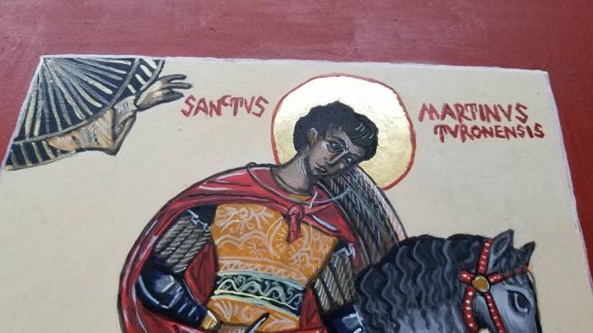
So, I don’t have a ton of pictures of this, mostly just the end result. The total was 3 floats of highlights, then the embellishments, inscription, shell gold, and border. Total amount of time on this one board: 15 hours. A “light” amount of work. @_@
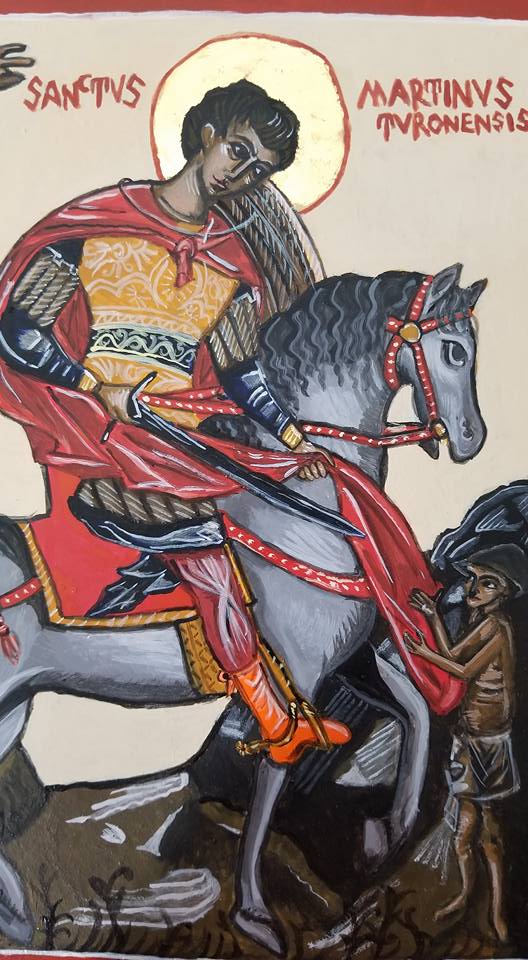
After the 3rd day of painting.Done!
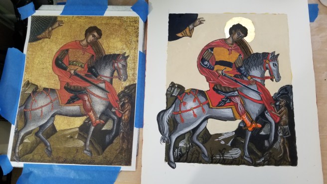
Use of a pattern doesn’t necessarily mean a copy, so I decided to veer from the original and give a contrast border. The inscription is in Latin, rather than Greek, since the original had the same (from what I could make out).
I did have some issues getting lines thin enough with my brushes. I think it’s a combination of my own pressure, them wearing out, and just not being thin enough for fine line work on smaller details. For icons where I just do the head or bust, they’re probably still fine, but I need to invest in tinnier liners! I also got a bit carried away with the shell gold on the Hand of God, but everybody loves gold!
I’m also utterly surprised at how good the horse came out.
It’s now setting up to be oiled in a few weeks, and hopefully dry before Pennsic and delivery to its commissioner. I hope they love it!
Next up is the War Sew-a-thon, but I’m hoping to get some paint down on the icon of St. Nicholas next, which is doubling as a backlog scroll for my husband’s Order of the Silver Crescent.
There’s not going to be many pictures from here on out, because I need to concentrate. So I probably won’t make another post until I do the finishing touches in a couple of days.
Anyways, the next step is layers of highlights and lowlights. This could be as few as two, or many, many more. So far, I’m thinking this is going to be a 3-highlight layer icon, but I could be surprised. Some areas, like the landscape, won’t need a ton of work, but the horse and skintone will take much more work. The detail lines are saved for the last day, along with the inscription and the outer border.
The trick with the egg tempera is to create different viscosities of the color to get the achieved effect. So you mix your color, then add water until you get what you need. This doesn’t always work smoothly and can take some time. Likewise, I had to go back and darken some of the more solid areas where the paint dried patchy. I lightened the background to create more contrast from the dark yellow ocher, and put back in the linework. Skin color takes on a chalky look, which is why the beggar looks a bit…weird, if not skeletal, this will soften up with the next layer.
This is when egg tempera gets fussy. While it dries fast, it takes overnight to cure. If you go back over a spot that’s wet, or didn’t cure, fresh paint can take it right up and leave you a hole straight to the gesso. You can see that on the horse’s haunch in the picture below. The best thing to do when this happens is LEAVE IT ALONE. Let it cure overnight, and then revisit it the next day. You really only get 2-4 hours to work on it anyway before this starts happening pretty much everywhere if you keep touching things, hence why the daily limit is so important. This is when patience is key, but it’s also a lot of fun as each day you get closer to a finished piece. I worked on the board for about 3 hours.
I’ll see everyone in a couple of days when I’m ready to finish it, and set up for the long cure before oiling.
Egg Tempera is a great medium, but it takes some getting used to. As far as iconography has gone, I have never used a ready-made paint. I have always used dry pigments mixed with egg binder, even in my not-so-great early pieces. I’ve since learned the quirks of it, but I still have a bit to go.
The binder is easy to make: egg yolk and white wine. The wine is optional, but it helps emulsify the egg a bit, as well as act as a preservative. Still, you only get a week, tops, with this stuff in the fridge after a day on your table.
First, gather your supplies! The wine name made you giggle.
My mixture this go around was 2 yolks and about “that much” of white wine. I’ve gotten to the point of knowing the color I want for the right mixture. You can separate the yolk from the white by transferring the goop back and forth between the broken eggshell halves. Then you pop the yolk with a folk, and let it slowly drain into the jar, catching the membrane in the process. If the membrane goes in, it’s not a huge deal, but you just need to make sure you don’t suck it up in the dropper later.
As you can see, it’s not a ton of liquid in a standard size mason jar, but a little goes a long way. You use drops, not tablespoons.
Once I get the magic liquid made, I go ahead and set up my table. I already had most of this out when the gilding started, but here you can see my collection of pigments, and that I taped wax paper down to protect my work surface. All of my pigments are from Earth Pigments or Natural Pigments, are are 100% natural earth or mineral colors. Mostly oxides, but also some crystals. The bagged jars are my quarantined toxic vermilion (mercury sulfide) and minium (red lead) pigments.
Egg tempera is backward from watercolor, you start dark and then add highlight layers. It seems weird, but it works. In iconography symbolism, you continue to “play God”, and build the paint up from the protoplasm, into a glowing, holy image.
Starting with the sankir, or base skin tone first. I mixed Antica Green Earth, and Roman Black. Think about the skin color of the Greeks and Middle Eastern people where this artform originated: olive based. Again, start dark, build up to light.
Dry Antica Green Earth.
Egg tempera can be fickle depending on how fine some of the pigments are ground, the material they’re made from, and how much moisture they suck up. Antica green is fickle and kind of grainy, so I had to adjust as I went along with more pigment, egg, or water, depending on my needs.
I made a ton of sankir, so I painted all three icons with it. This isn’t always the best approach and it sort of busted my flow for the rest of the day, but they all have the same base mix, which is good. The rest of this icon-a-long will be for St. Martin.
I don’t have pictures of work on Martin, because, well, I was painting. It’s a time consuming process, and it takes hours. Total amount of work today alone was about 4 hours.
You work the paint in tiny brush strokes from a small drop on the board, rather than long strokes.
The perfect cloak red in icons comes from vermilion, real vermilion. I have a few different reds, but nothing paints like the real thing. So the real thing needs precautions. I keep it quarantined in its own baggy, with its own tools. Instead of using one of my palettes, or shells (I do have shells, the porcelain is just easier to clean) I use a plastic spoon that I can keep separate. While vermilion is considered inert once painted, the dry form is still toxic, it is still mercury, and needs to be controlled.
Of course, once I got started with it, a warm fuzzy thing decided to distract me.
That’s Harald Hardrada, Varangian kitty, King of Norway, Maine Coon superfoof.That red, though.
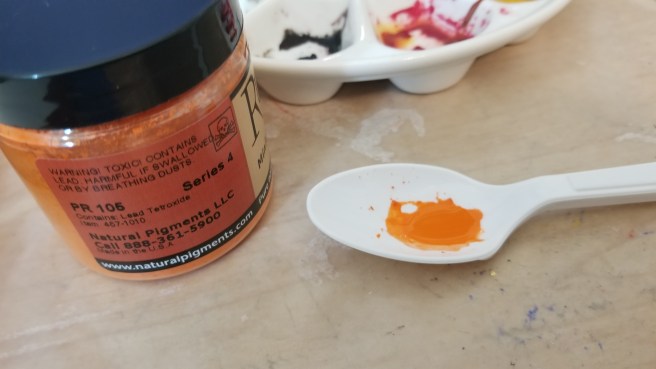
I had to use a tiny bit of the minium as well. It’s one of my favorite colors. As shocking orange as you can get, and a fully period color.
After getting tired, taking a break halfway for dinner, and coming back to it, and still getting tired while finishing up the background, which is okay, because more coats will make it more opaque, but I’m bushed. I know it looks super weird, but over the next few days, the icon should “appear” as I add the highlights.
So. Part of blogging a process as you go along means it’s harder to hide mistakes. Mistakes are a natural process of life, and as such, I hate them. But, as part of a learning process, I’m not sugar coating this post. I made some booboos, and learned that Florida humidity is unkind to the icon gilding process.
The icon process is pretty specific. You breathe an open-mouthed hot breath on the bole to create condensation, and the loose gold will adhere. It’s basically a form of water gilding with mouth moisture. (ewww.) But, this is symbolic of the breath of God, it’s also super period. After yesterday, I may have to cheat for the few years I’m down here.
I grew up in Florida, so the heat and humidity aren’t any sort of surprise. I don’t think I’m as tolerant of it as I used to be after living in New England and experiencing seasons, and living in perfect-almost-all-the-time Southern California. I learned how to gild in New England. I used fake composite gold in Rhode Island, but had graduated to real gold in New Hampshire. In retrospect, all of my icon work up there was during the winter. In California, I only gilded the halo of St. Nicholas, but I remember it being almost too perfect.
And now, I’ve returned to Hell Incarnate, and failed to prepare myself for the difficulty that awaited me. Anyways, here’s some pictures.
Avengers assemble! 2 burnishers, some 23kt double gold loose leaf, and cut wax paper.
First thing first, I burnished the bole on the halos to a high sheen. I screwed up here. Twice, on both icons. I either pushed too hard, or it wasn’t set up right, because I ripped up spots of bole on each one and had to put more down, and let it set. This would bite me for the rest of the day.
Michael’s halo partially burnished to a high shine.Burnishing Martin’s halo. This takes time. If you go too hard or too fast, you WILL rip up the bole.
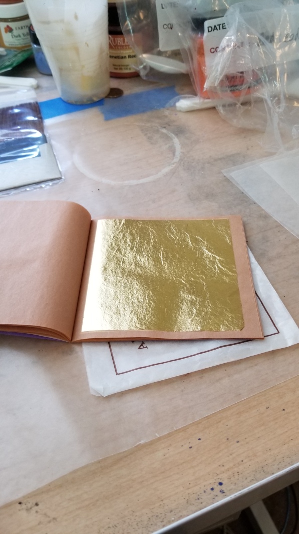
Once I succeeded, I prepared the gold leaf. The easiest way to do this is to use wax paper to catch the leaf versus trying to use a gilders knife. At least, that’s the way I was taught?
So shiny!Wax on…Wax off.You can cut the leaf once it’s on the wax paper with ordinary scissors. No cushion or knife required.
Once the gold was transferred to the wax paper and cut, all I had to do was breathe some hot air and slap it down, right? No. The first piece I used didn’t adhere at all. Naturally, I don’t have pictures of this part, since I was super perplexed, and then it became a fight. Then war was declared. And what is supposed to be a meditative, relaxing art for me turned into digging into the trenches and not coming out of the room until I had this gold down, dammit.
This was probably not the best approach. What I SHOULD have done, was troubleshoot via the internet and the scribal community.
This is Martin, as I’m fighting to get coverage on one side of the halo after the first layer bombed. You can see the layers of leaf I was using to get it to stick, and how it wasn’t TOUCHING a few spots. Pinholes are normal, gaping holes are not. Layers are normal, layers that don’t cover gaping holes are not.
While I was getting frustrated, I must have spittled on the icon a bit, or too much condensation built up, and gold went down ONTO MARTIN’S FACE.
I honestly assumed that with the extra humidity, regardless of central AC, that the gold would be wanting to stick to literally everything, and I would have had the opposite problem. It wanted nothing to do with it. The equilibrium between the temperature of my breath and the board, or the amount of water in the air and my breath, must have been off. Boards do absorb water, which leads them to warp with age, so it was suggested after my Facebook venting by a Trimarian scribe that I should put the board in the fridge for a while next time, to see if I can dehydrate it and cool it off, and get more condensation.
Michael’s first layer. I was flabbergasted.
After the first round. I went downstairs, had some tea, and attempted to re-center myself. I didn’t take pictures of the gold on the wax paper, I wish I had: It was terribly patchy. And while it’s normal for it to come off in smaller pieces if I’m focusing on an area, it was doing that the whole time. I was getting bubbles and oxidation I had never seen before.
After my break, I figured enough time had passed for me to go ahead and burnish Martin’s halo. NOPE. It started great, and then the leaf just started coming right up, and exposed the bole. I gave up, regilded his whole halo, and decided that was enough handling of that icon for the time being.
Shiny enough to reflect my phone and then…ACK!3 sheets of gold later: Those nice forehead smudges. I should be able to sand it down and paint over it, but that’s not the point.
I went back to Michael with a new plan of attack: Tenting the halo with the wax paper as I breathed on it, and then slamming the gold down quickly. It seemed a bit violent, but it worked. I didn’t dare attempt to burnish.
There’s still some exposed spots and pinholes, but I’ve decided to fix that with shell gold, and the painted halo outline.
For comparison, here’s Nicholas, who I gilded in California. Practically no blemishes, and a thickness nice enough to press a design into even on my rough, homemade board.
I went downstairs after all of this, and had a stiff drink. This was 4 solid hours of work from start to finish. While one should take their time, that seems a bit excessive for simple gilding. The gold is down for these guys, but I need to reassess my approach now that I’m living in the swamp again.
Painting is up next. Let’s hope the threat of cockroaches eating fresh egg tempera doesn’t come true.
This post shows you the deepest darkest secret of iconography: the patterning process.
This is tongue in cheek for obvious reasons. Why?
I will let you all stop screaming.
No, really. While many iconographers draw their own images, the vast majority of them are made from patterns that have existed since the Middle Ages or Early-Modern period. You can go on Amazon right now and find dozens of books of icon patterns and line art for this purpose. Copying is period. In fact, I was able to see an actual medieval icon pattern in person, once. I was unable to take a picture, but it was made of animal skin, and had the image punched into it so the iconographer could transfer it over onto their panel with a stylus. How else do you think so many icons look identical, save details and color?
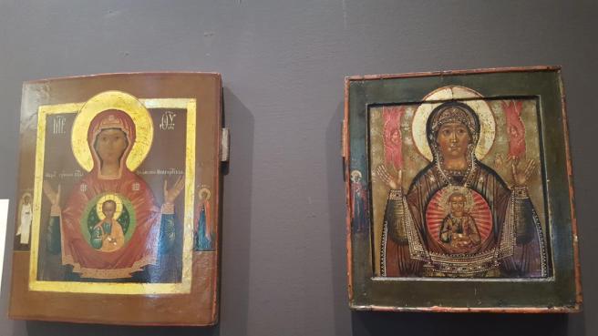
Two icons of “Sign, Mother of God” at the Museum of Russian Icons, Clinton, MA. The same pattern, but with different colors and embellishments. Note the position of the halo on each with the border and kovcheg.
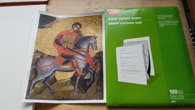
I’m too poor to afford skins I can dedicate to patterns, but I can use the modern method of carbon paper, which is how most schools today teach it. (I do believe carbon paper, or a form of it, is period, but let’s not grasp at straws for stunt documentation.)
So, the way to do this is fairly straight forward. I’m using an 11×14 panel for an 8×10 printout, so I need to measure that out to create my border. Then I play the corner matching game and tape the image with the carbon paper down to the panel with painters tape. After that, using a dull pencil or a ballpoint pen, I go ahead and trace over the lines I need to create the line art. No need to get too detailed, because I learned early on you do too much work on the pattern, and paint over and lose all those detail lines. That’s all work you do on top of the base layers.
Drawing the guidelines.Taping on the stencil.Finished cartoon.
After you get a successful trace, go back in with a graphite pencil and fix some details and missed lines.
Notice how the original icon has the horse tail coming out of the border. I did the same.
After you have your line art, it’s time to prep for gilding.
Always get your gold down before painting. Gold will stick to all the things, so it’s important that you get it to stick to the only thing you want for the time being, and that’s a substance called bole.
I’ve mentioned this before in my previous icon posts, but bole is a mixture of red clay and hide glue. I’ve made it before, but I also like buying it ready made from Pandora because it make my house not smell gross and my stove and floors not get stained. Since I live in military housing, paying for others to do this for me is a great convenience.
I put two thick layers of bole down on the halo, and then a rough, thin layer on the edge of the board. This is highly symbolic in the icon process, but also important: the bole provides a cushion for the gold to have a design engraved into it if desired, and the layer on the edge helps protect the board while it’s being handled. In icon speak, it’s the base of earth from which God shone the divine light at creation (halo), and the edges are symbolic of the roughness and mortality of the artist. It’s kind of dark, and I love it. Because I paint these as an historical art in a secular manner, versus something that will be used for actual veneration, I don’t dwell too much on the sanctity of the process, but it makes a great mnemonic for the process, because the order of operations matters for a practical reason, as well as spiritual.
Thick layer of wet bole on the icon of St. Martin.While that dried, I patterned Archangel Michael. Don’t worry about the guidelines, they can be erased and re-drawn.Putting bole down on Michael’s halo.Second thick layer of bole on St. Martin. It’s important to be mindful of air bubbles, which can ruin the smoothness of gold adhesion.Coating the edges.Ready to dry overnight and take on gold leaf.
After the bole cures, I’ll use an agate burnisher to smooth it out, but that will have to wait until tomorrow morning. If all goes well, I’ll be able to get the gold leaf down, and the first layer of egg tempera on all three icons.
To put things in perspective before painting, here’s the three brushes I use most of the time.
I have a few commissions coming up, and I decided I wanted to blog(ish) the process rather than keep it under wraps, since they aren’t gifts. I had to decided if I was going to do it on Facebook between my personal account, or my SCA persona page (which I rarely post on), and decided that I should just put it here, so it’s more accessible for those that don’t spend their day on social media as much as I do. It will also help me be more accountable in making regular updates.
So, to begin, let’s talk about the actual surface on which to be painted.
Icon boards, in their most simplest, are layers of gesso (calcium carbonate and hide glue) on a sanded and prepped wooden surface. Well-made boards have a layer of linen glued to the surface of the board before application of the gesso. In early period, this was mostly basswood. In early-modern and modern icons, it’s typically poplar. Both woods are still available today, of course. Basswood is not that durable, it’s a soft wood used for wooden models. I do have a panel of it somewhere I plan to paint someday, but until then, I spend money and have other people do this for me.
I have made my own panels. They are not good, but I did it. Using pre-sanded and drilled birch panels from an art store, I had a heck of a time applying gesso and sanding. This is not the job for me. And that’s okay, because the creation of icon boards is an artform in its own right, and was probably done by a different person in period than the actual painter. The Norman has more experience with woodworking and patience than I do, so my own boards are on the horizon, just not imminently so.
I purchase my high-end boards commercially. And by “commercially”, I mean, from Pandora Icon Supplies, which is a subsidiary of the Prosopon School based here in the states. They are not “manufactured”, because, much like high end papers for the C&I community, it requires a level of craftsmanship, and the price reflects this, so I’d call them more of a purveyor of fine art supplies. I just recently made an order after scrimping and saving for 2 years just to buy new materials, but they’re worth every penny. Sometimes there’s a turnaround time, sometimes they ship right away. These are handcrafted, so you have to anticipate some leeway. Pandora offers a lower-cost alternative in the form of the birch gessoed panel, which is still professional grade, but does not have the same thickness or carved surface of the fine icon board. Their larger fine board will have the slats in the back to help control the inevitable warping over time. Smaller boards, like the one I have below, do not. I can’t currently justify the cost of a larger, high-end board until I use up my supply on hand. I already want to start hoarding these like fabric.
Basswood, poplar, and birch are all Old World AND New World woods. In Europe, “linden” is the name of basswood, and “aspen” is used for some poplar variants. Black poplar is probably the one that was used most for boards in period, and that also grows here in North America. The taxonomic differences are probably minimal, which means that if someone were to go to a hardwood supplier here in the states, they would get wood suitable for making panels, without having to spend an exorbitant amount of money importing something we don’t have.
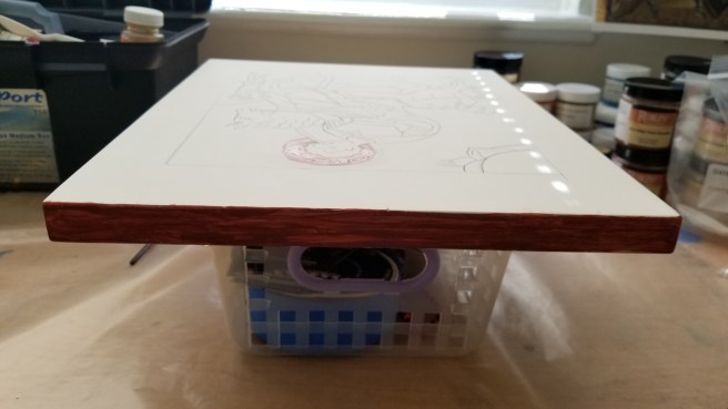
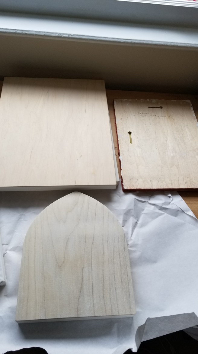
My current collection. The top row I have 2 11″x14″ Pandora “BGP” (Birch Gessoed Panels), which is a more affordable way to invest in a well-made board without breaking the bank, next to my own smaller panel that is currently getting worked on with St. Nicholas. At the bottom, you have a larger 10×15″ BGP still wrapped in paper, and a fine, 8″x10″ poplar panel with a kovcheg (recess). The BGPs pictured here were $60 a piece, and the fine board was $80. My 8″x10″ panel was like $20 of supplies a lot of swearing.
The backs of the board so you can see the exposed grain of the wood. The birch is nice, but the poplar is mesmerizing.
My upcoming projects are a commission of St. Martin of Tours, and St. Michael the Archangel for myself, because I need to start keeping some art. St. Nicholas of Myra as the patron saint of sailors is for my husband.
Coming next: Patterning the icon, and preparing the surface for gilding.


You must be logged in to post a comment.