As of this point, I am taking a step back from the SCA for a duration of time yet to be determined. I will still show up at some events, but current politics, coupled with exhaustion due to drama and other issues has driven me out.
I am happy to continue to field questions and will be actively monitoring my site until I feel fit to return to my research for the society’s purpose. Until then, I am going to be focusing on my mundane research for upcoming conferences, and consider moving forward with my PhD.
Sorry about not posting this sooner, I needed a brain decompression period post-Pennsic.
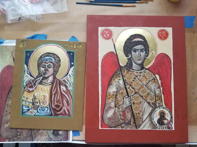
I was honored to serve as a champion of the East Kingdom’s Arts and Sciences War Point team this summer, and decided that it was the perfect time to complete an icon of Michael the Archangel that I had planned on for some time. Since I’ve posted previously about my process, this is mostly just a picture (and video) dump.
The best part? This belongs to me. It’s not a gift or a scroll for somebody else, he gets to stay in my personal collection, and I’m happy about this. I’m also insanely happy with how it came out.
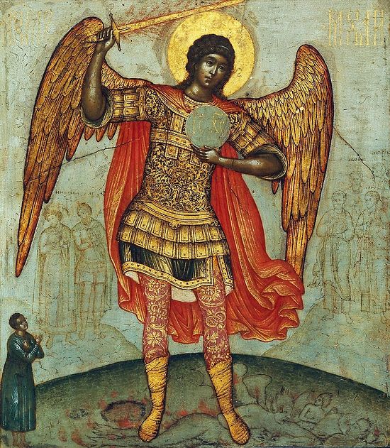
The original icon is dated to the 15th Century at the Church of Panagia Angeloktisti, Kition, Cyprus.
And here is my finished piece, on a 11×14″ poplar panel from Pandora Icon Supplies:
Slew of progress shots:
And a comparison between this one, and my first Michael icon from September 2013:
While working on this, I decided I was going to video myself, and then roll it into a timelapse, here is the result! Yeah, the musical choices aren’t really, uh, Byzantine, but some of them could work. Maybe. 😉
This is definitely more of an aristocratic tradition than a lower class tradition, though I assume that well-to-do merchant class Byzantines may have had a tiered wardrobe.
While doing research, you may find annotations or information for clothing known as “undress”, or “court undress”. Before you think you need to get nekkid, look at the context. It’s somewhat antiquated, but the concept of “undress” is the lowest level of acceptable dress. Not really your pajamas, but something you could be comfortable being seen in, while out for a meal in the palace with friends, or maybe the emperor if the occasion is not a state one.
Basically, court undress is your business casual, while full court dress is your best of the best ceremonial-grade garments. In between could be half-dress, your “cocktail hour” attire, or something you would wear to a weekly liturgy at your local basilica, a gathering at the palace, or a less formal court. Coronation? Easter? Christmas? A marriage? Get your good stuff on, non-optional.
It’s no secret that I love garb. I sew a lot, and probably own way more than I actually need to. My reasoning, or at least, what I tell people, is that you really can only get better and learn to understand new patterns and shaping if actually get the needle out. Another reason, is that stratifying my Byzantine collection is important. I’m still working on it, and developing more “undress” for myself as an aristocratic woman.
For example, my 12th Century outfit? This is not for everyday wear. This only gets trotted out for special occasions, namely coronations, and fashion shows because it’s just so extra. This is court dress. The propoloma elevates it.
But then, you have my 11th Century set which I made for my thesis. Is this court dress? Well, the mantle certainly kicks it up. But it’s not the highest ceremonial dress. Why? I’m not wearing a propoloma, I’m in a fakiolion instead. Could I wear this to court? Yes. Probably not for a coronation, or for Easter/Pascha ceremonies. But this would be acceptable for an event where fine dress is required. It could even be undress if I lost the mantle. That is more or less adding an air of piety to cover my shoulders for the divine liturgy. If I added a propoloma to this, it would be court dress without question. This is a good example of half-dress.
True undress? Probably more along the lines of this look. I’m in a minimally decorated wool delmatikion, with a plain white veil. I still have jewelry on, as I am aristocratic and need to wear some wealth, but this was Festival of the Rose out in Caid in February of 2017, and not a major event like Coronation or Crown Tournament. I was comfortable and completely dressed, I just don’t have a full body picture.
A good source for a woman in aristocratic undress would probably be the Theodore Psalter, which Tim Dawson references for similar reasons in “By the Emperor’s Hand”. Here, the woman pictured in well dressed, but not weighed down by ceremonial accouterments. This is something more along the lines of what I should be wearing regularly (when it’s not as hot as the surface of the sun outdoors.)
I do have a couple older linen delmatikioi I should try wearing more beyond Pennsic when I’m not melting down here.
Another level, though I am unsure if this is truly an aristocratic woman or not, is from this miniature in the Menologion of Basil II. I like this because it doesn’t have the long angel sleeves, and clearly has a short-sleeved esoforion beneath it. However, I’m not sure, exactly, who she is. Is this the empress in her “casual” wear because of the red boots? Is this a middle class woman? Either way, it’s another form of undress. My guess if she is aristocratic, or the empress, it’s very much of a “It’s warm out, and I’m keeping to myself” type of clothing. It’s still pretty ornamented, and red is not a cheap color. Of note is the fact that it is clearly an emergency situation with the “bad omen” in the sky, and her head is uncovered outdoors. Lots of questions!
Anyways, I hope this post helps people think a bit more about building a tiered wardrobe. It’s definitely something I need to put more thought into working on for myself.
It’s always a fun occasion when you find out a good friend is getting an award that means a lot. In this case, a good friend, Count Ioannes Aurelius Serpentius, was being awarded the Silver Rapier in the East Kingdom for prowess on the fencing list field.
Being that mean sneaky friend that I am, I offered my service as the scribe for this award, and put in the request with Tyger Clerk of the Signet. Once things got out of the holding pattern, the date for the award was moved up a bit, so I had to jump in on this a bit earlier than planned. Dropping my list of silk banner commissions and other projects to the wayside, I allowed the scroll assignment to take the wheel.
I ordered a finished panel from Pandora at a size a bit smaller than I usually go, 9.5×12.5″ versus 11×14″. It wouldn’t change the size of the cartoon I would have to make from the original, but make it a bit easier to ship from Trimaris to the East in a flat rate box. I would just have to get a bit creative with the scroll text.
I went ahead and did that first while I waited for my order to come in. Knowing it would have to be short and sweet, I went through a selection of Byzantine kontakia to find one that I could rework into an award for martial prowess. Of all things, I landed on the Kontakion of the Annunciation of the Most Holy Theotokos, dating from as early as the 6th Century: (Theotokos translates as Mother of God. This is a hymn to the Virgin Mary.)
To thee, the Champion Leader, we thy servants dedicate a feast of victory and of thanksgiving as ones rescued out of sufferings, O Theotokos; but as thou art one with might which is invincible, from all dangers that can be do thou deliver us, that we may cry to thee: Rejoice, thou Bride Unwedded.
And then my reworking into a secular scroll:
Kontakion of the Awarding of the Silver Rapier to Count Ioannes Aurelius Serpentius:
To thee, Ioannes, we, Wilhelm and Vienna, King and Queen of the East dedicate a feast of victory and of thanksgiving. O Ioannes, but as that art one with might which is invincible, from all dangers that can be do thou deliver us, that we may bestow upon thee: A Companion of the Order of the Silver Rapier. On this day, November 17th, at our One Hundred Minutes War, Anno Societatis LIII.
There is a bit of fun irony here. The first being that the award was being given out just a few days prior to American Thanksgiving, and two, it was Ioannes’ birthday. So for his birthday, the royals dedicated a feast of victory and thanksgiving, which would be a very period thing to do to for a peer being bestowed an accolade of some type. In the Byzantine tradition, commemorations of an individual would be held on birthdays, and anniversaries of death. The document that was involved with my thesis/Compleat Anachronist, includes Kale Pakouriane authorizing a bequest of icons to the monks of Iviron to be used in the commemorative feasts for her husband, Symbatios, who was buried at the monastery. I have yet to pinpoint if icons were used for awards for living individuals, but I admit I haven’t chipped away at that research as much as I should be.
Finding the right icon to pattern turned out to be harder. The East Kingdom loves giving out “alterative” scrolls to the traditional ink and pergamenata creations by extremely talented scribes and artisans, so I knew I was throwing my hat into the pro ring. I decided it was going to be Michael the Archangel, since he is the patron of basically all things martial including fencing. Archangels are also not inherently symbolic of any one faith, as they exist in all three of the Abrahamic religions (Judaism, Christianity, and Islam), Zoroastrianism, and I believe also in the modern religion of Baha’i. They have considerably ancient roots and were prevalent during the classical through medieval periods in three continents, thus making them generally a safe choice to be enjoyed by all.
But I needed to find a badass Michael. Most period icons are of him standing in splendor or just a bust. These are lovely pieces, but I needed more pizazz. I found it in this considerably late Russian piece that is inching out of period, though some Cavalier fencers would say not, so this is my nod to those folks who bend the rules in one direction, just as I bend them in the other.
Easy peasy. Totes.
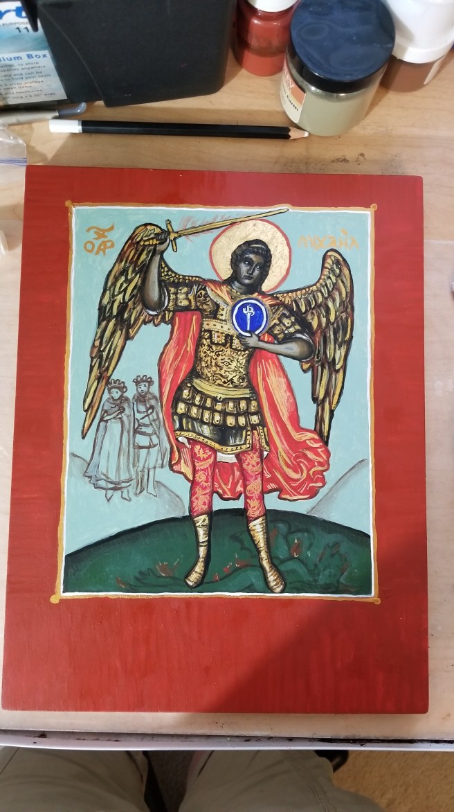
Of course I couldn’t find something simple. The palette was dark, probably from the aging of the pigments used, it was probably made on a much larger scale that I was about to try with, so some details were going to be skipped. I decided that I would leave the earth, the devil under Michael’s feet, and the figures to the right (our left) of Michael, who I would attempt to transform into Count Ioannes and Countess Honig. The orb would be used for the order’s heraldry.
Sure. No problem. I had weeks still.
First, I had to revisit the hell that is gilding in Florida. It was suggested that I use a mixture of gum arabic and honey to make an adhesive for the gold. And that is what I did. What I didn’t do, though, was give it enough time to dry. This resulted it some of it squeezing out from under the leaf, and taking some gold with it. Because of this, it took me some time to get smooth, even coverage, and I ended up using 2 full leaves of double ducate 23k gold on that small halo. I decided that panicking over the smeared gold was going to be useless, so I sanded it with my agate burnisher once the gold was set, which took 48 hours, despite us having a cold front at the time. I got an okay burnish, but since I had a nice thick layer of gold in addition to the bole beneath it, I pressed designs into the halo to make it look textured, and hide my flaws.
Then the protoplasm went down a day later. I wanted that gold as set as possible to avoid any more mistakes….except…that…wow, that sankir (skin color base) was wicked dark. I had overestimated the deep palette a wee bit, and understimated the richness of my blend with the egg medium. It was just Antica green earth and Roman black, and I have had it go on more translucent before, so the only person to blame was myself for not testing the color first. I also bit down and did the cloak in real vermilion (mercury sulfide, for those playing at home), because it is the accurate color, and nothing paints as nicely as it does. This put it immediately into the “DO NOT LICK” category of SCA art. Pretty much everything else is an ocher pigment, including the ultramarine blue and the crimson red used on his leggings. You can see how the vermilion looks a bit more orange against the crimson, which is what I saw looking at the original.
So on my first day of brush-on-board, I created a super dark, toxic ethereal being.
The next day, I basically had to sand off the sankir on Michael’s face, and hand-draw in the facial features so I could actually do any highlighting. The end result was a bit creepy, if not demonic. It gave me the jim jams.
So now, Michael was super dark, toxic, and demonic. Where was this going?!?!
But I recovered after a night of crabbing to Gieffrei, who reminded me that Ioannes would be happy with a stick figure as long as I drew it. Unfortunately, I wasn’t happy, but I was determined.
The first workover of highlights gave him a grumpy old “can’t even” look. Angels are androgynous and youthful. So that wouldn’t do, and would need another pass. I was pleased with the way the delicate florals came out on the cuirass and leggings. I put in an evil eye amulet for luck. You should be able to see it dead center.
I devoted an entire Sunday to getting the highlights down in two sessions. It’s not always a good idea to go over tempera layers a lot in the same day because it can pull up the paint and expose the panel. You have to let it set and harden overnight for best results, but I bent the rules. I put in what I think was two 4-hour sessions that day. Break time was spent grocery shopping and eating dinner, despite insisting that I needed no sustenance. My husband thought I was going insane, but I couldn’t pull myself way, and the time was well worth it.
And then the gold happened. This is watercolor, not shell gold, but the set I have is great. Archangels are divine, and as such, can be slathered (tastefully) in gold. And that’s what I did.
I gave myself a couple of days to allow for the paint to cure and harden, as I mulled over how I was going to do the border and words. I needed a contrast, and the only color I could think of would be Venetian red. It’s not my favorite pigment to work with since it tends to stay grainy and fight back against the medium by not absorbing it well for some reason, but it did come out the way I wanted it to after two coats. I also got the inscription down in my nice watercolor gold, and the border.
The text would need to be white to pop, but I also need to give that tempera a solid 24 hours of curing time before I attempted to write on it. Once that day passed, I went in there with a ruler and white colored pencil, and gently laid out the text. I decided that the words “Order of the Silver Rapier” would be done with the white gold in the palette to emulate silver, and to give a subtle sparkle. Gold was used as the spacers. I am not a calligrapher, and painting with a brush is hard, but I got it cleaner than I expected to.
And the finished wording:
Some cleanup work with the Venetian red, and VOILA! DING! Scroll is done!
Comparison with the original. Naturally, there was no way I could make an exact copy, but I think I did the piece justice in my own style:
And then the attempts to take as many artsy shots as possible on a solid background under my desk lamp to show lumanescence. Tempera is naturally shiny, so gold leaf and metallic paints just add more shiny, and this wasn’t as easy to photograph as say, a more flat painting would be, hence the varied angles to get different results.
This entire icon was painted almost entirely with a 3/0 brush. After completing it, I went out and purchased a 12/0 and 20/0 for even finer detail now that my skills are being honed.
I’ve been waiting for weeks to post about this. Secrets are so hard to keep when you’re excelling at something. I’m sad it had to depart to its new owner, but I know his face, and the face of those assembled at court will make it worth it.
I was super nervous shipping it north, even though we had time, the weather was starting to turn in New England, I was hoping it wouldn’t get stuck out in the snow or get soaked in a Nor’easter downpour. There was a massive sigh of relief once I heard it was received safely.
…Of course, I still need to oil varnish it. But that can’t be done until their Majesties provide their John Hancocks. 😉
Back in the day, which is always a Wednesday, before we began our Knowne World Tour, it was arranged for Jeff to get his Silver Crescent at the same event as his Maunche because he was leaving Portsmouth for San Diego. Because of this, scroll requests got backed up. I wrote the words for his Crescent that was read in court, but he had no scroll. I promised him I would write an icon for him. THEN-
He left for Caid.
I got assigned Konstantia’s Herald Extraordinary scroll.
I wrote my thesis.
I moved to Caid.
He deployed.
I got the gilding down on this.
His backlog scroll came in from the East, and it’s lovely and I gave up.
He came back.
I did things other than paint.
We moved to Trimaris.
I was like, “Oh I still have this.”
And he was like, “So where is it?”
Here it is. 3 years later.
Panel is one of my handmade ones on a birch art panel with my own gesso. It is a hot mess and was not easy to paint on. I noticed the places where I didn’t sand as well, or touched a lot during demos and displays were prone to pitting and bad adhesion of the tempera. On the bright side, a lot of the flaws I had were the same flaws I saw on very old post-period/in-period panels. So there’s that, I guess. If anyone can take my experimental art and actually like it, it would be Gieffrei, anyway.
Saint: Nicholas of Myra, known to most of us as Santa Claus, but also the patron saint of sailors, and, of course, heretic puncher supreme. The reason I chose him should be evident. (Hint: Nothing to do with punching heretics.) The pattern is modern. Most period icons of St. Nicholas are rather boring and rarely show him with a boat/in a boat. Those are all post-period.
Green sky/blue water = Jeff’s arms, sans martlets, though in retrospect, I could have drawn one in. Green is also his favorite color.
Silver Crescent is on the boat, not only because service to his kingdom, but also to his country.
Inscription around the border: Γοδεφρείδος, Αργυρά Ημισέληνος της Ανατολής. “Gieffrei (Godefredus in Latin and Greek), Silver Crescent of the East.”
Main inscription just says Saint Nikolas.
After it cures for a couple of weeks, I will oil it, let it sit for a month, and then it can join the gallery on the staircase as an actual scroll.
The great shell massacre of 2018. Shells care of the Atlantic Ocean.
Progress Shots:
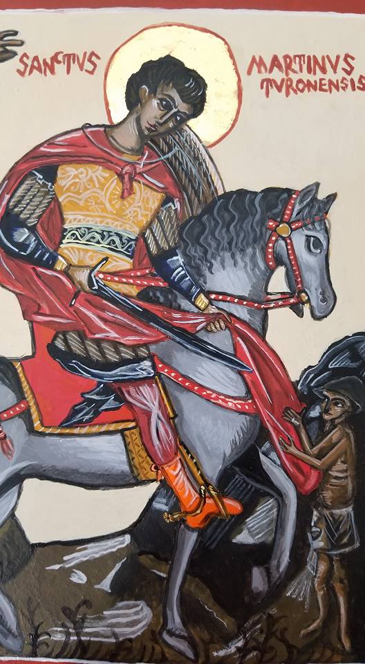
Finished:
So pretty. So…messy compared to my porcelain palette.
So, I don’t have a ton of pictures of this, mostly just the end result. The total was 3 floats of highlights, then the embellishments, inscription, shell gold, and border. Total amount of time on this one board: 15 hours. A “light” amount of work. @_@
After the 3rd day of painting.Done!
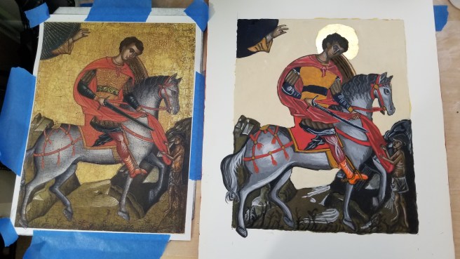
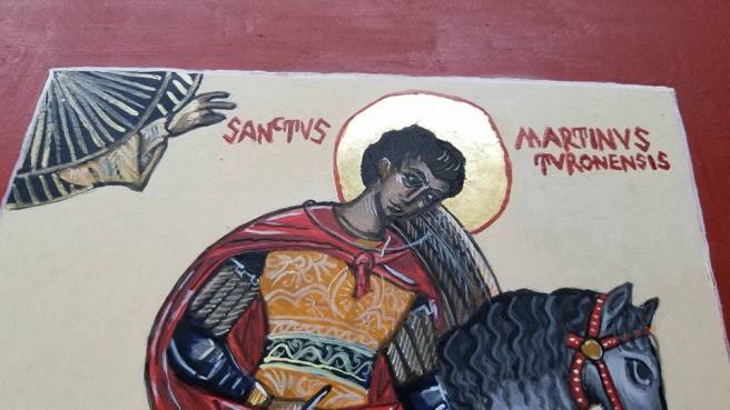
Use of a pattern doesn’t necessarily mean a copy, so I decided to veer from the original and give a contrast border. The inscription is in Latin, rather than Greek, since the original had the same (from what I could make out).
I did have some issues getting lines thin enough with my brushes. I think it’s a combination of my own pressure, them wearing out, and just not being thin enough for fine line work on smaller details. For icons where I just do the head or bust, they’re probably still fine, but I need to invest in tinnier liners! I also got a bit carried away with the shell gold on the Hand of God, but everybody loves gold!
I’m also utterly surprised at how good the horse came out.
It’s now setting up to be oiled in a few weeks, and hopefully dry before Pennsic and delivery to its commissioner. I hope they love it!
Next up is the War Sew-a-thon, but I’m hoping to get some paint down on the icon of St. Nicholas next, which is doubling as a backlog scroll for my husband’s Order of the Silver Crescent.
There’s not going to be many pictures from here on out, because I need to concentrate. So I probably won’t make another post until I do the finishing touches in a couple of days.
Anyways, the next step is layers of highlights and lowlights. This could be as few as two, or many, many more. So far, I’m thinking this is going to be a 3-highlight layer icon, but I could be surprised. Some areas, like the landscape, won’t need a ton of work, but the horse and skintone will take much more work. The detail lines are saved for the last day, along with the inscription and the outer border.
The trick with the egg tempera is to create different viscosities of the color to get the achieved effect. So you mix your color, then add water until you get what you need. This doesn’t always work smoothly and can take some time. Likewise, I had to go back and darken some of the more solid areas where the paint dried patchy. I lightened the background to create more contrast from the dark yellow ocher, and put back in the linework. Skin color takes on a chalky look, which is why the beggar looks a bit…weird, if not skeletal, this will soften up with the next layer.
This is when egg tempera gets fussy. While it dries fast, it takes overnight to cure. If you go back over a spot that’s wet, or didn’t cure, fresh paint can take it right up and leave you a hole straight to the gesso. You can see that on the horse’s haunch in the picture below. The best thing to do when this happens is LEAVE IT ALONE. Let it cure overnight, and then revisit it the next day. You really only get 2-4 hours to work on it anyway before this starts happening pretty much everywhere if you keep touching things, hence why the daily limit is so important. This is when patience is key, but it’s also a lot of fun as each day you get closer to a finished piece. I worked on the board for about 3 hours.
I’ll see everyone in a couple of days when I’m ready to finish it, and set up for the long cure before oiling.
Egg Tempera is a great medium, but it takes some getting used to. As far as iconography has gone, I have never used a ready-made paint. I have always used dry pigments mixed with egg binder, even in my not-so-great early pieces. I’ve since learned the quirks of it, but I still have a bit to go.
The binder is easy to make: egg yolk and white wine. The wine is optional, but it helps emulsify the egg a bit, as well as act as a preservative. Still, you only get a week, tops, with this stuff in the fridge after a day on your table.
First, gather your supplies! The wine name made you giggle.
My mixture this go around was 2 yolks and about “that much” of white wine. I’ve gotten to the point of knowing the color I want for the right mixture. You can separate the yolk from the white by transferring the goop back and forth between the broken eggshell halves. Then you pop the yolk with a folk, and let it slowly drain into the jar, catching the membrane in the process. If the membrane goes in, it’s not a huge deal, but you just need to make sure you don’t suck it up in the dropper later.
As you can see, it’s not a ton of liquid in a standard size mason jar, but a little goes a long way. You use drops, not tablespoons.
Once I get the magic liquid made, I go ahead and set up my table. I already had most of this out when the gilding started, but here you can see my collection of pigments, and that I taped wax paper down to protect my work surface. All of my pigments are from Earth Pigments or Natural Pigments, are are 100% natural earth or mineral colors. Mostly oxides, but also some crystals. The bagged jars are my quarantined toxic vermilion (mercury sulfide) and minium (red lead) pigments.
Egg tempera is backward from watercolor, you start dark and then add highlight layers. It seems weird, but it works. In iconography symbolism, you continue to “play God”, and build the paint up from the protoplasm, into a glowing, holy image.
Starting with the sankir, or base skin tone first. I mixed Antica Green Earth, and Roman Black. Think about the skin color of the Greeks and Middle Eastern people where this artform originated: olive based. Again, start dark, build up to light.
Dry Antica Green Earth.
Egg tempera can be fickle depending on how fine some of the pigments are ground, the material they’re made from, and how much moisture they suck up. Antica green is fickle and kind of grainy, so I had to adjust as I went along with more pigment, egg, or water, depending on my needs.
I made a ton of sankir, so I painted all three icons with it. This isn’t always the best approach and it sort of busted my flow for the rest of the day, but they all have the same base mix, which is good. The rest of this icon-a-long will be for St. Martin.
I don’t have pictures of work on Martin, because, well, I was painting. It’s a time consuming process, and it takes hours. Total amount of work today alone was about 4 hours.
You work the paint in tiny brush strokes from a small drop on the board, rather than long strokes.
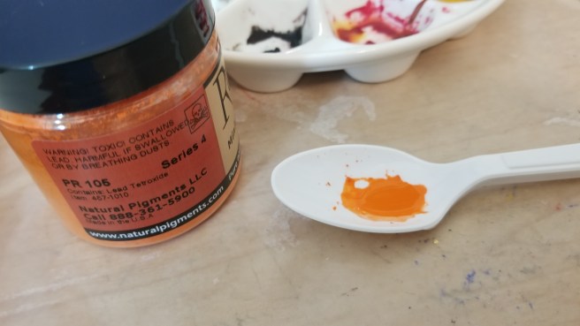
The perfect cloak red in icons comes from vermilion, real vermilion. I have a few different reds, but nothing paints like the real thing. So the real thing needs precautions. I keep it quarantined in its own baggy, with its own tools. Instead of using one of my palettes, or shells (I do have shells, the porcelain is just easier to clean) I use a plastic spoon that I can keep separate. While vermilion is considered inert once painted, the dry form is still toxic, it is still mercury, and needs to be controlled.
Of course, once I got started with it, a warm fuzzy thing decided to distract me.
That’s Harald Hardrada, Varangian kitty, King of Norway, Maine Coon superfoof.That red, though.
I had to use a tiny bit of the minium as well. It’s one of my favorite colors. As shocking orange as you can get, and a fully period color.
After getting tired, taking a break halfway for dinner, and coming back to it, and still getting tired while finishing up the background, which is okay, because more coats will make it more opaque, but I’m bushed. I know it looks super weird, but over the next few days, the icon should “appear” as I add the highlights.
So. Part of blogging a process as you go along means it’s harder to hide mistakes. Mistakes are a natural process of life, and as such, I hate them. But, as part of a learning process, I’m not sugar coating this post. I made some booboos, and learned that Florida humidity is unkind to the icon gilding process.
The icon process is pretty specific. You breathe an open-mouthed hot breath on the bole to create condensation, and the loose gold will adhere. It’s basically a form of water gilding with mouth moisture. (ewww.) But, this is symbolic of the breath of God, it’s also super period. After yesterday, I may have to cheat for the few years I’m down here.
I grew up in Florida, so the heat and humidity aren’t any sort of surprise. I don’t think I’m as tolerant of it as I used to be after living in New England and experiencing seasons, and living in perfect-almost-all-the-time Southern California. I learned how to gild in New England. I used fake composite gold in Rhode Island, but had graduated to real gold in New Hampshire. In retrospect, all of my icon work up there was during the winter. In California, I only gilded the halo of St. Nicholas, but I remember it being almost too perfect.
And now, I’ve returned to Hell Incarnate, and failed to prepare myself for the difficulty that awaited me. Anyways, here’s some pictures.
Avengers assemble! 2 burnishers, some 23kt double gold loose leaf, and cut wax paper.
First thing first, I burnished the bole on the halos to a high sheen. I screwed up here. Twice, on both icons. I either pushed too hard, or it wasn’t set up right, because I ripped up spots of bole on each one and had to put more down, and let it set. This would bite me for the rest of the day.
Michael’s halo partially burnished to a high shine.Burnishing Martin’s halo. This takes time. If you go too hard or too fast, you WILL rip up the bole.
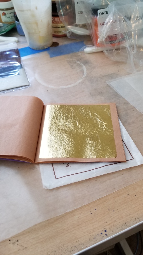
Once I succeeded, I prepared the gold leaf. The easiest way to do this is to use wax paper to catch the leaf versus trying to use a gilders knife. At least, that’s the way I was taught?
So shiny!Wax on…Wax off.You can cut the leaf once it’s on the wax paper with ordinary scissors. No cushion or knife required.
Once the gold was transferred to the wax paper and cut, all I had to do was breathe some hot air and slap it down, right? No. The first piece I used didn’t adhere at all. Naturally, I don’t have pictures of this part, since I was super perplexed, and then it became a fight. Then war was declared. And what is supposed to be a meditative, relaxing art for me turned into digging into the trenches and not coming out of the room until I had this gold down, dammit.
This was probably not the best approach. What I SHOULD have done, was troubleshoot via the internet and the scribal community.
This is Martin, as I’m fighting to get coverage on one side of the halo after the first layer bombed. You can see the layers of leaf I was using to get it to stick, and how it wasn’t TOUCHING a few spots. Pinholes are normal, gaping holes are not. Layers are normal, layers that don’t cover gaping holes are not.
While I was getting frustrated, I must have spittled on the icon a bit, or too much condensation built up, and gold went down ONTO MARTIN’S FACE.
I honestly assumed that with the extra humidity, regardless of central AC, that the gold would be wanting to stick to literally everything, and I would have had the opposite problem. It wanted nothing to do with it. The equilibrium between the temperature of my breath and the board, or the amount of water in the air and my breath, must have been off. Boards do absorb water, which leads them to warp with age, so it was suggested after my Facebook venting by a Trimarian scribe that I should put the board in the fridge for a while next time, to see if I can dehydrate it and cool it off, and get more condensation.
Michael’s first layer. I was flabbergasted.
After the first round. I went downstairs, had some tea, and attempted to re-center myself. I didn’t take pictures of the gold on the wax paper, I wish I had: It was terribly patchy. And while it’s normal for it to come off in smaller pieces if I’m focusing on an area, it was doing that the whole time. I was getting bubbles and oxidation I had never seen before.
After my break, I figured enough time had passed for me to go ahead and burnish Martin’s halo. NOPE. It started great, and then the leaf just started coming right up, and exposed the bole. I gave up, regilded his whole halo, and decided that was enough handling of that icon for the time being.
Shiny enough to reflect my phone and then…ACK!3 sheets of gold later: Those nice forehead smudges. I should be able to sand it down and paint over it, but that’s not the point.
I went back to Michael with a new plan of attack: Tenting the halo with the wax paper as I breathed on it, and then slamming the gold down quickly. It seemed a bit violent, but it worked. I didn’t dare attempt to burnish.
There’s still some exposed spots and pinholes, but I’ve decided to fix that with shell gold, and the painted halo outline.
For comparison, here’s Nicholas, who I gilded in California. Practically no blemishes, and a thickness nice enough to press a design into even on my rough, homemade board.
I went downstairs after all of this, and had a stiff drink. This was 4 solid hours of work from start to finish. While one should take their time, that seems a bit excessive for simple gilding. The gold is down for these guys, but I need to reassess my approach now that I’m living in the swamp again.
Painting is up next. Let’s hope the threat of cockroaches eating fresh egg tempera doesn’t come true.


")


You must be logged in to post a comment.